Our goal with the SPAM redesign was to do more than modernize the packaging. We wanted the can itself to communicate just how versatile SPAM really is.
Instead of presenting it as a product with one expected use, the new packaging showcases the many ways SPAM is cooked and enjoyed around the world, helping the brand feel more versatile, global, and relevant to a new generation of consumers.

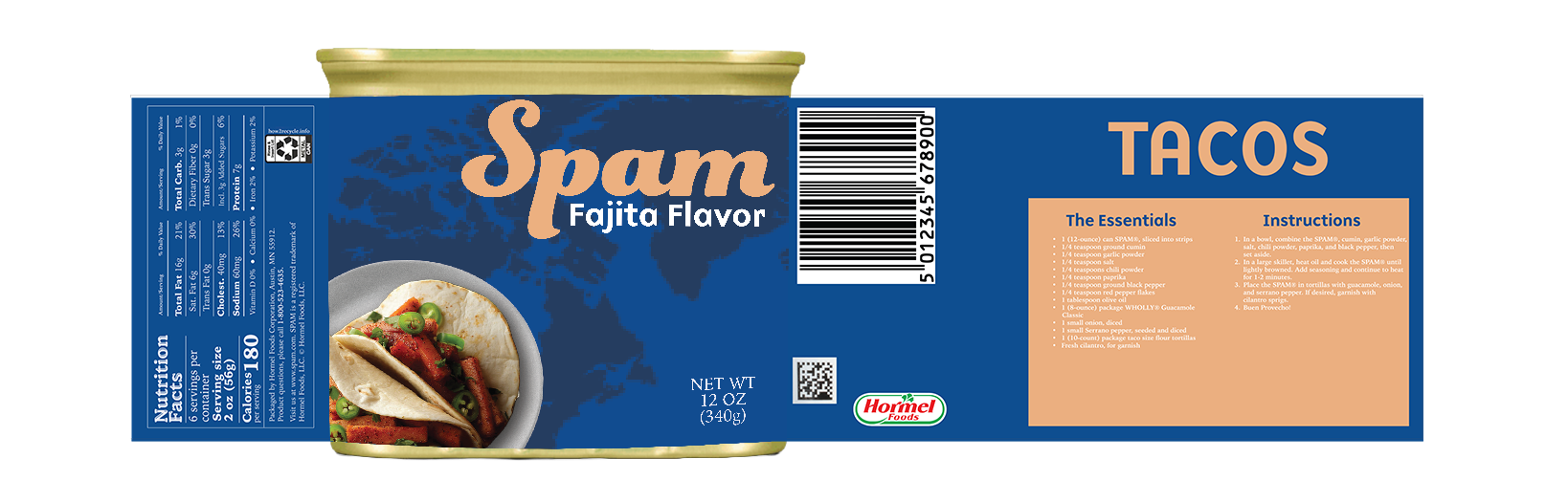
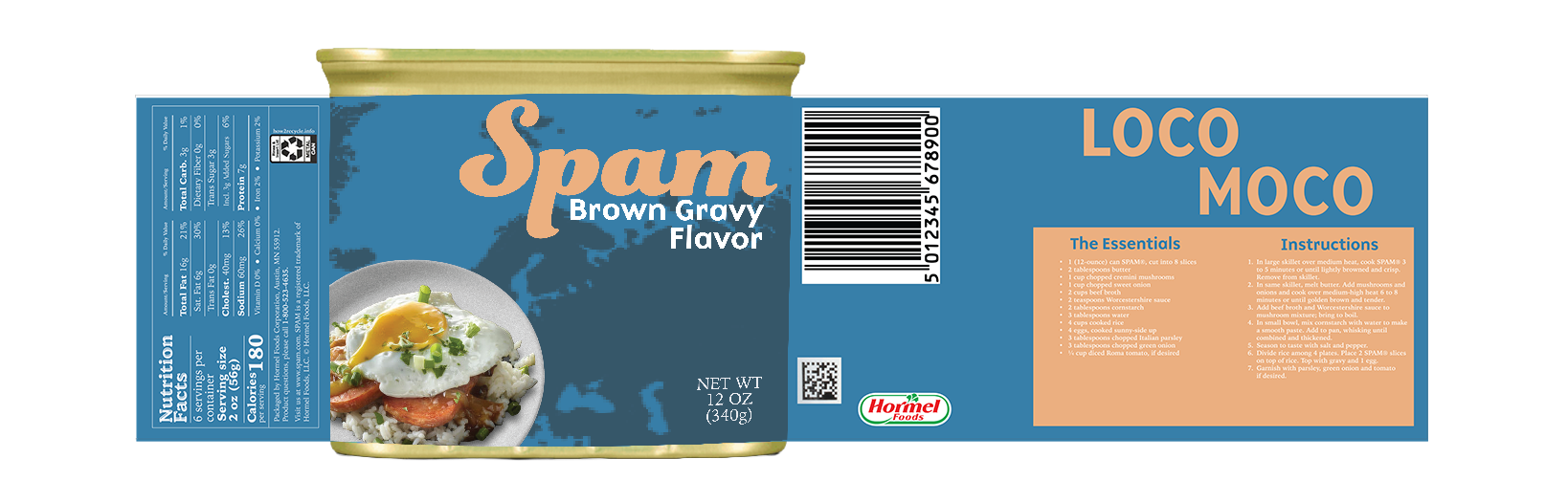
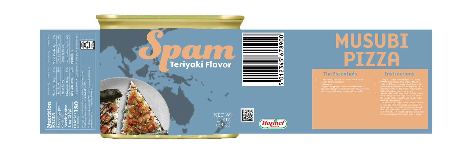
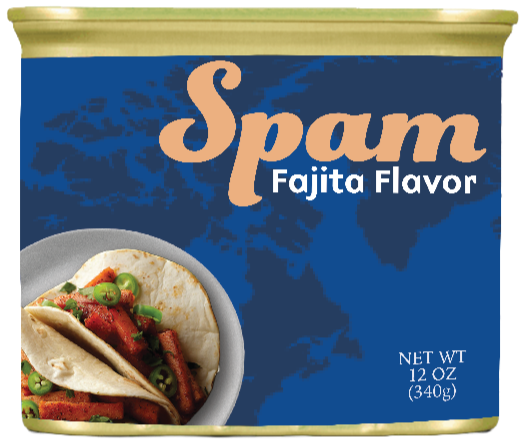
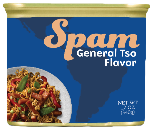
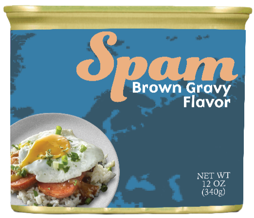
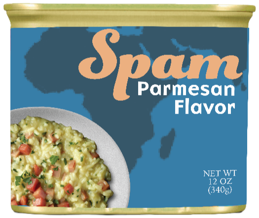
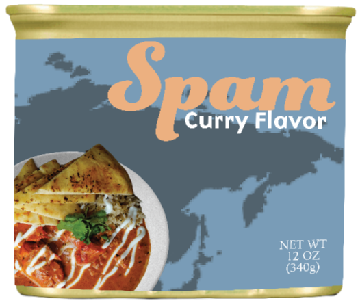
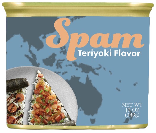
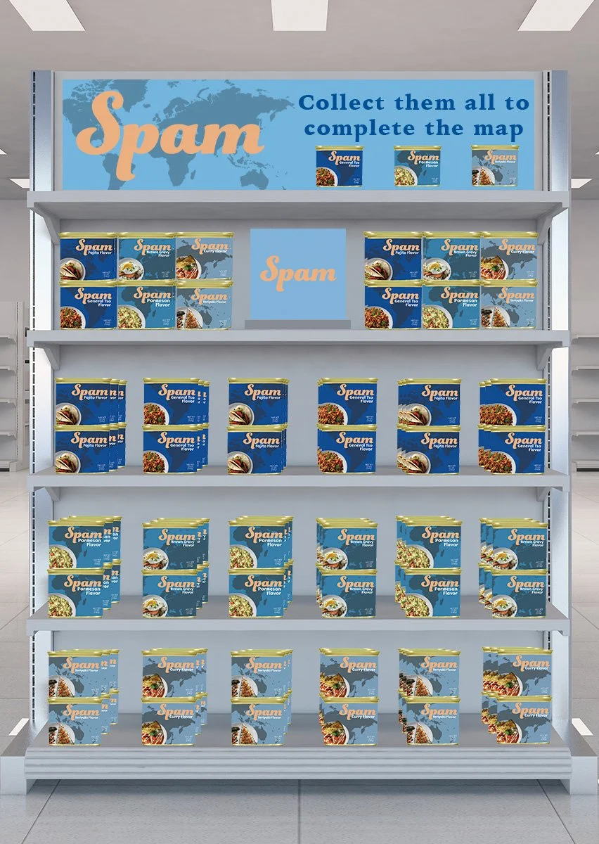
To make SPAM feel more culturally diverse in the way it’s used, we introduced a map-inspired visual system into the packaging. Each can highlights different SPAM flavors alongside recipes inspired by cuisines from around the world, helping communicate the product’s versatility across cultures.
Modernizing the brand also meant moving beyond SPAM’s traditional blue-and-yellow palette and rethinking the logo. Different shades of blue flow across the cans to reinforce the map concept, while a script typeface adds a sense of movement reminiscent of water.
To connect the identity more closely to the product itself, we introduced a warmer brand color inspired by the actual look and feel of SPAM.
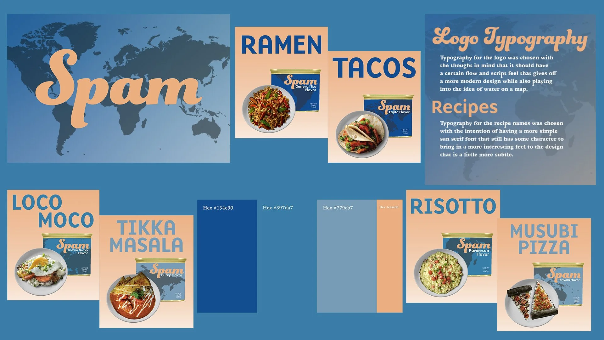

The map system extends across the full collection. When six cans are stacked in the correct arrangement, they come together to form a complete world map.
This turns the packaging into more than a visual refresh - it becomes an interactive puzzle and collectible, giving people a reason to seek out different cans and complete the set.


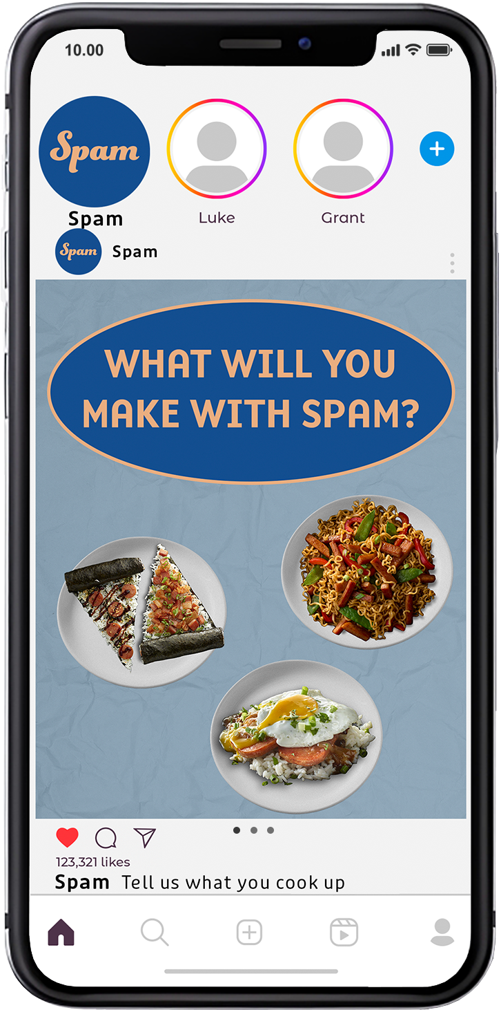
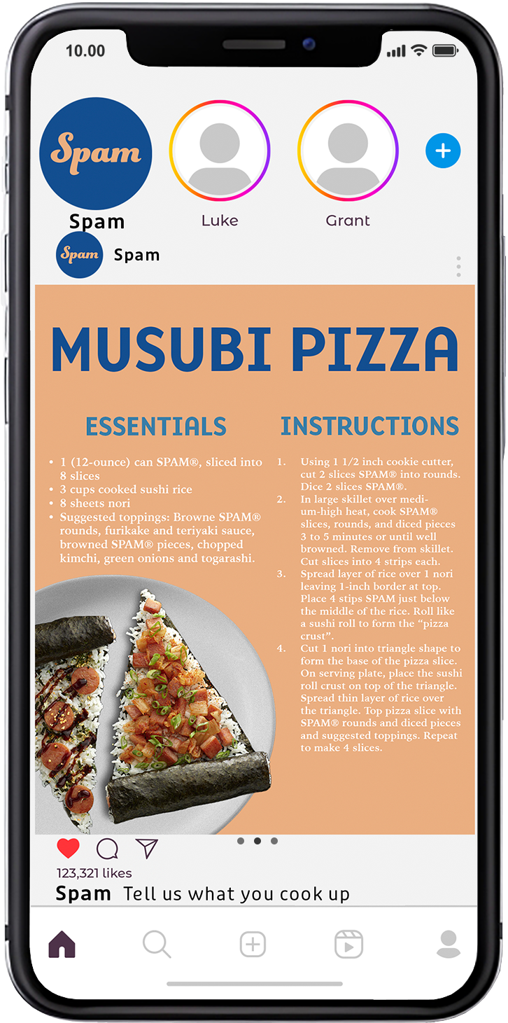
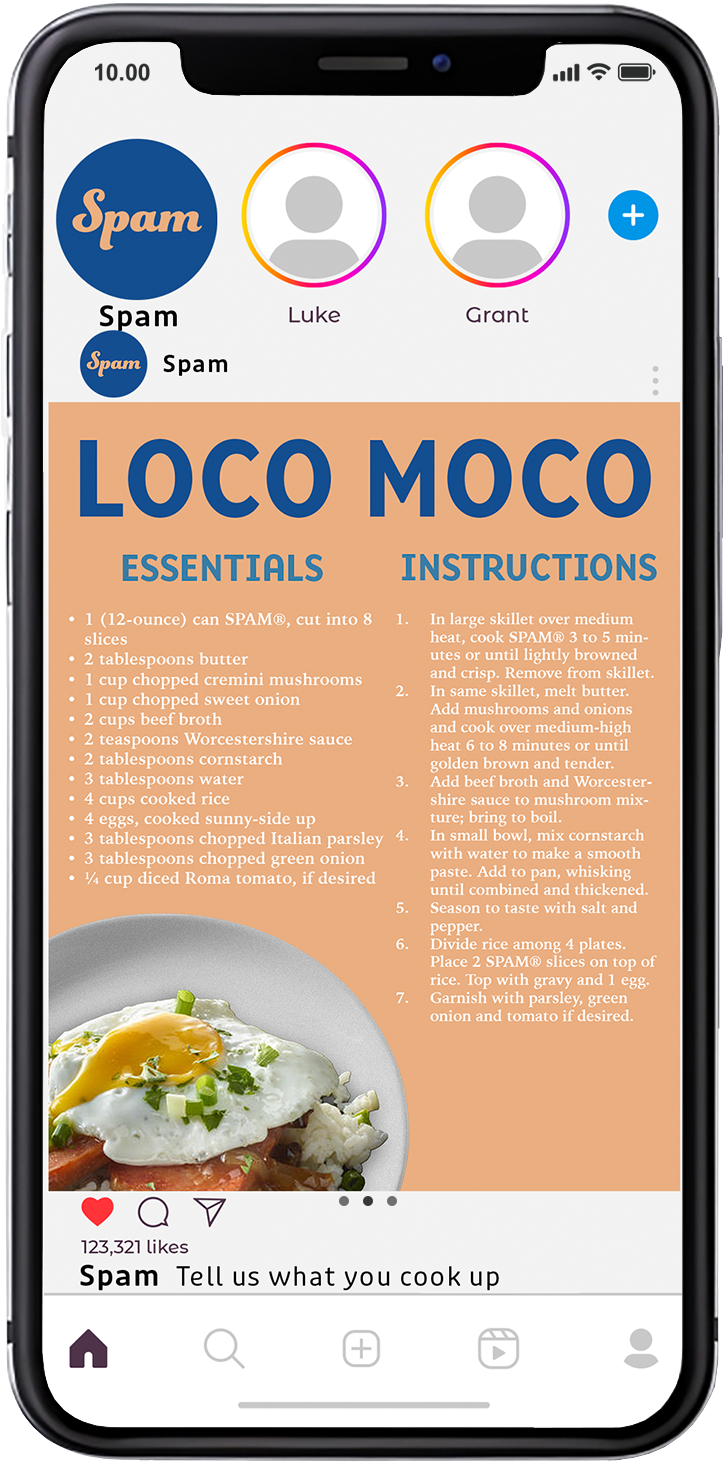
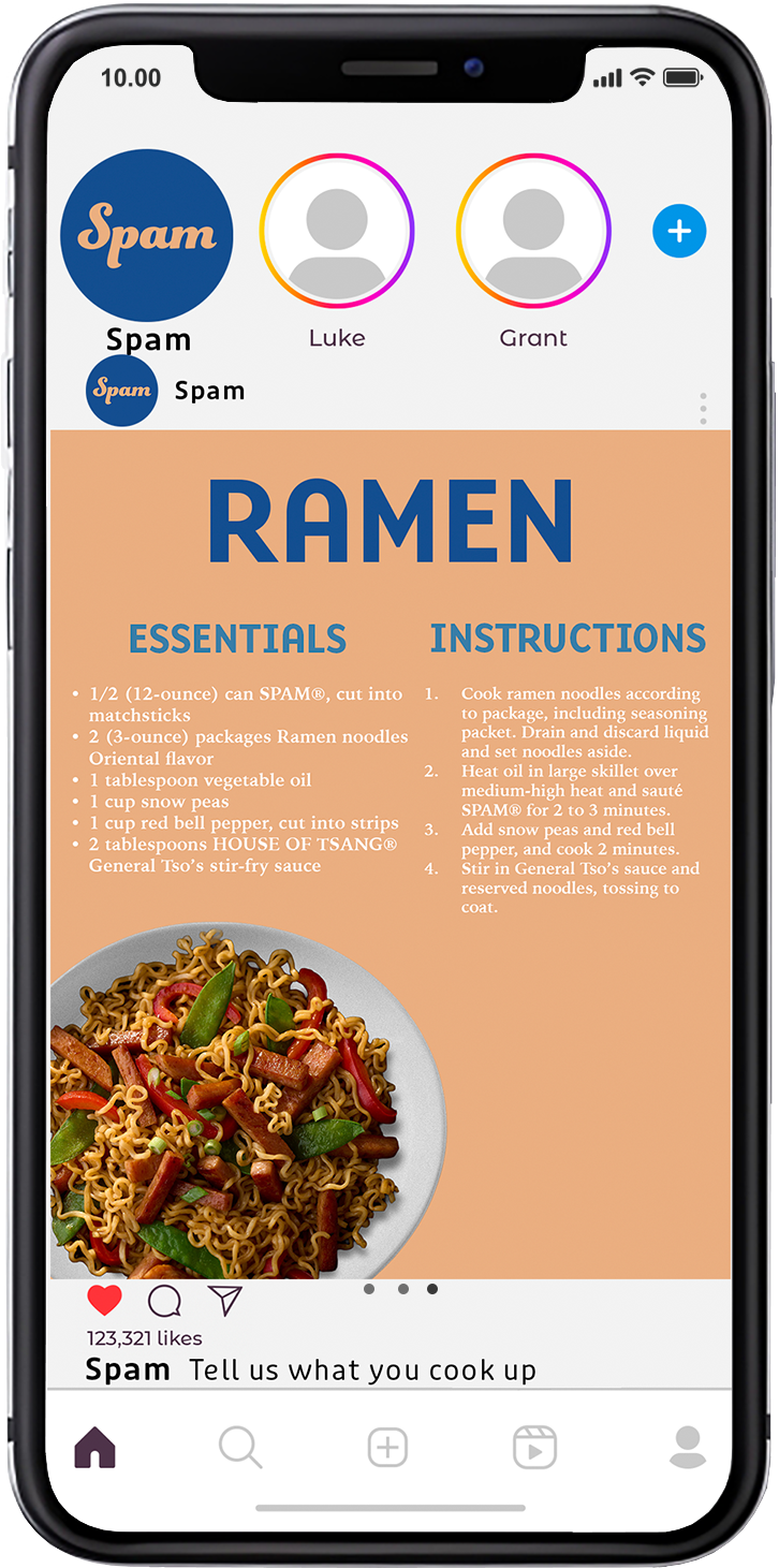
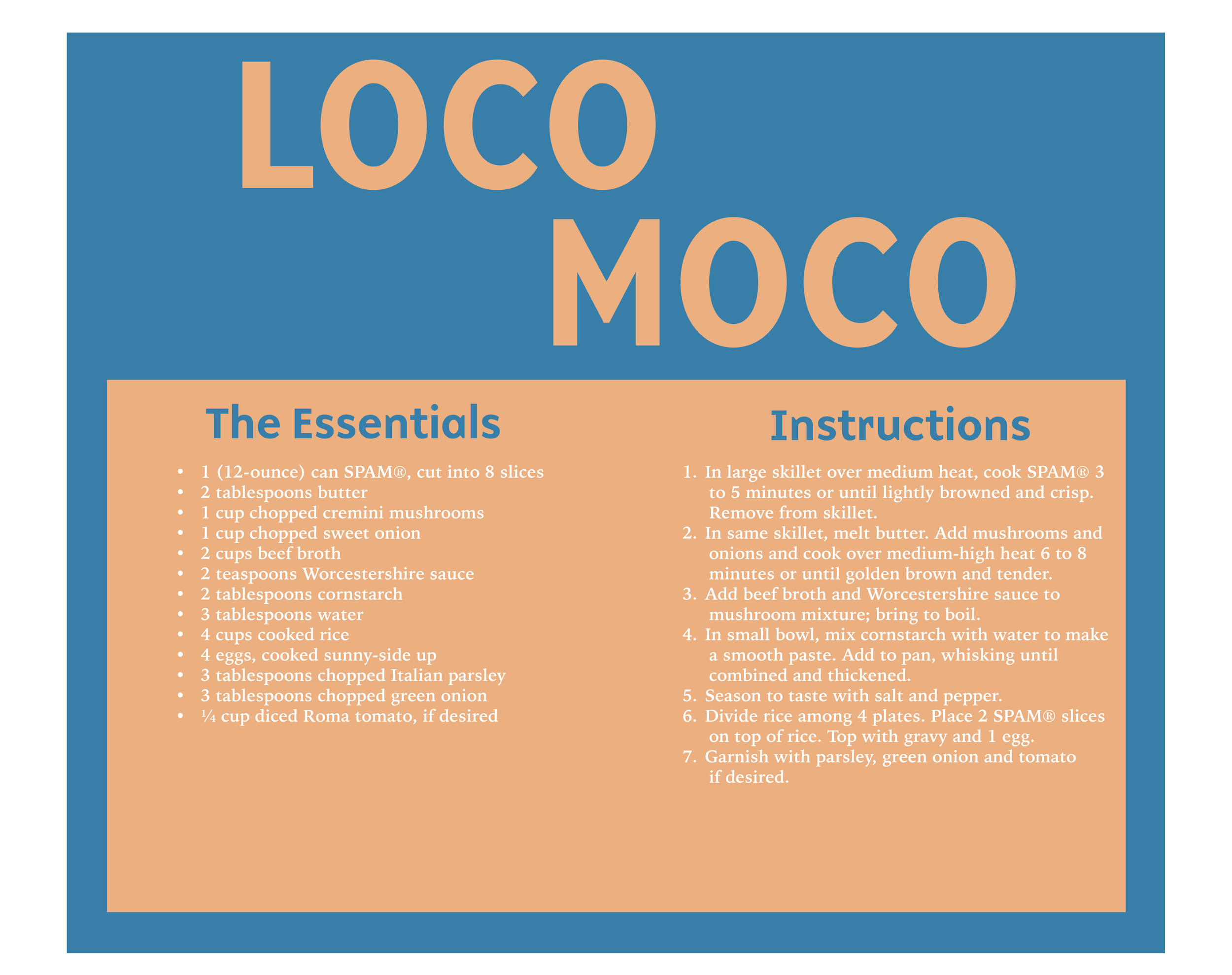
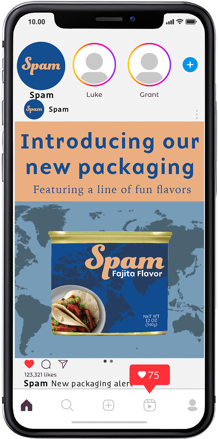
Debuting the new packaging design means bringing it to social and showing off SPAM’s new style.
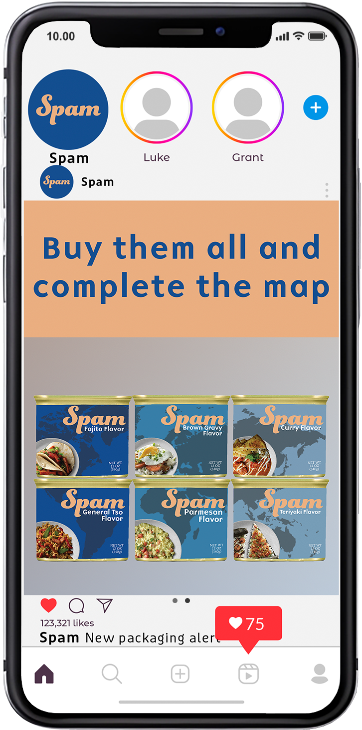
And to keep the buzz going, SPAM will also have a series of recipe posts to show off the different dishes you can make with the various flavors of SPAM, while also getting consumers to engage and share what they make.